
Definition
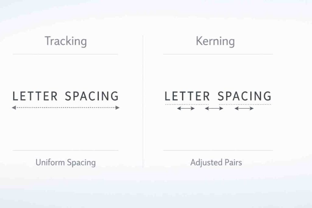
Tracking and kerning are both typography techniques used to adjust spacing between letters. Tracking changes spacing across entire words or blocks of text, while kerning adjusts the space between individual letter pairs. Understanding the difference helps improve readability and design quality.
Typography plays a vital role in design, communication, and readability. Whether you are creating a website, designing a logo, or writing a document, the way text looks can affect how people understand and feel about your content. Two important concepts in typography are tracking and kerning.
Many people confuse tracking and kerning because both involve spacing between letters. However, they serve different purposes and are used in different situations. Using the wrong spacing technique can make text look unbalanced, hard to read, or unprofessional.
Tracking controls the overall spacing of a group of letters, while kerning focuses on adjusting the space between specific letter pairs. Both are essential for creating visually appealing and readable text.
In this article, we will explore the differences between tracking and kerning, how they work, their advantages and disadvantages, real-world examples, global usage, common mistakes, and practical exercises. By the end, you will have a clear understanding of how to use both techniques effectively in design and writing.
Quick Answer and Overview
Tracking and kerning both adjust letter spacing but differ in scope and purpose.
Tracking adjusts spacing uniformly across a word, sentence, or paragraph. Kerning adjusts spacing between specific pairs of letters to improve visual balance.
| Feature | Tracking | Kerning |
|---|---|---|
| Scope | Entire text | Individual letter pairs |
| Purpose | Adjust overall spacing | Fix uneven gaps |
| Usage | Paragraphs, headings | Logos, titles |
| Control Level | General | Precise |
| Effect | Consistent spacing | Balanced appearance |
Definition and Explanation
What is Tracking
Tracking refers to the adjustment of spacing across a group of letters. It affects entire words, sentences, or paragraphs uniformly. Designers use tracking to make text more readable or to fit content within a specific layout.
Increasing tracking creates more space between letters, making text appear airy and open. Decreasing tracking brings letters closer together, making text appear compact.
Tracking is commonly used in body text, headings, and large blocks of content where consistency is important.
What is Kerning
Kerning refers to adjusting the spacing between individual pairs of letters. It focuses on improving the visual balance of text by fixing uneven gaps that naturally occur between certain letter combinations.
For example, letters like A and V may appear too far apart if not kerned properly. Kerning corrects this by reducing or increasing the space between specific letters.
Kerning is especially important in logos, headlines, and display text where precision and aesthetics matter most.
How Tracking and Kerning Work
Tracking works by applying a uniform spacing adjustment across all characters. It is like stretching or compressing a word evenly.
Kerning works by fine-tuning specific letter pairs. It is more detailed and requires careful visual judgment.
For example:
- Increasing tracking in a paragraph improves readability for large text blocks.
- Adjusting kerning in the word “AVOID” ensures letters look evenly spaced.
Both techniques are often used together to achieve professional typography.
Advantages and Disadvantages
Advantages of Tracking
- Improves readability in long text
- Helps fit text into layouts
- Easy to apply consistently
- Useful for adjusting visual density
Disadvantages of Tracking
- Too much spacing reduces readability
- Too little spacing makes text cramped
- Does not fix uneven letter gaps
Advantages of Kerning
- Creates visually balanced text
- Essential for logos and branding
- Improves professional appearance
- Fixes awkward spacing between letters
Disadvantages of Kerning
- Time-consuming for large text
- Requires design experience
- Not practical for long paragraphs
Real-World Examples
Example 1: Website Design
Tracking is used to improve readability in paragraphs and headings. Slightly increased tracking makes text easier to read on screens.
Example 2: Logo Design
Kerning is critical in logos. Brands adjust spacing between letters to create a balanced and professional look. Poor kerning can make logos appear unpolished.
Example 3: Print Media
Magazines and newspapers use tracking to adjust spacing in columns. Kerning is used in headlines to ensure visual appeal.
Example 4: Advertising
Large text in advertisements often uses both tracking and kerning. Tracking creates emphasis, while kerning ensures balance.
Regional and Global Usage
Typography practices vary across regions, but tracking and kerning are universally important in design and communication.
North America and Europe
Designers emphasize precision and readability. Kerning is widely used in branding and advertising, while tracking is adjusted for digital readability. Professional tools like Adobe Illustrator and InDesign are commonly used.
Asia
In countries like Japan, China, and South Korea, typography must adapt to complex writing systems. Tracking and kerning are applied carefully to maintain readability across characters. Digital design trends focus on clean and minimal spacing.
Middle East
Arabic typography requires unique spacing adjustments due to connected letterforms. Designers focus more on proportional spacing rather than traditional kerning.
Latin America
Typography blends creativity and readability. Tracking is often used in bold designs, while kerning enhances branding and promotional materials.
Africa
Growing digital adoption has increased awareness of typography. Designers use tracking and kerning in web design, branding, and advertising with modern tools.
Globally, the rise of digital media has made typography more important than ever. Proper use of tracking and kerning ensures better communication and user experience.
Common Mistakes
| Mistake | Why It’s Wrong | Correct Approach |
|---|---|---|
| Using tracking instead of kerning | Does not fix uneven gaps | Adjust individual letter pairs |
| Overusing tracking | Makes text hard to read | Use moderate spacing |
| Ignoring kerning in logos | Leads to poor design | Fine-tune letter spacing |
| Applying kerning to long text | Inefficient and unnecessary | Use tracking for paragraphs |
| Not testing readability | Affects user experience | Review text visually |
Exercises with Answers
Exercise 1
Identify whether tracking or kerning should be used:
- Adjusting spacing in a paragraph
- Fixing uneven gap between A and V
- Improving readability of a heading
- Designing a logo
Answers:
- Tracking
- Kerning
- Tracking
- Kerning
Exercise 2
Choose the correct technique:
| Scenario | Tracking | Kerning |
|---|---|---|
| Adjust paragraph spacing | Yes | No |
| Fix letter pair spacing | No | Yes |
| Improve readability | Yes | No |
| Design logo text | No | Yes |
Related Concepts and Comparisons
Tracking vs Kerning vs Leading
| Feature | Tracking | Kerning | Leading |
|---|---|---|---|
| Function | Letter spacing overall | Letter pair spacing | Line spacing |
| Scope | Group of letters | Individual letters | Lines of text |
| Purpose | Readability and layout | Visual balance | Vertical spacing |
| Usage | Paragraphs | Logos, headings | Body text |
Typography and Readability
Tracking and kerning both contribute to readability. Proper spacing improves comprehension, reduces eye strain, and enhances visual appeal.
Designers often combine tracking, kerning, and leading to create balanced typography.
Practical Tips for Using Tracking and Kerning
- Use tracking for large blocks of text
- Use kerning for headlines and logos
- Avoid extreme spacing adjustments
- Test readability on different devices
- Use professional design tools for precision
- Keep consistency across designs
FAQs
What is the difference between tracking and kerning?
Tracking adjusts spacing across all letters, while kerning adjusts spacing between specific letter pairs.
When should I use tracking instead of kerning?
Use tracking for paragraphs and large text blocks to improve readability.
When should I use kerning?
Use kerning for logos, headlines, and designs where precise spacing is needed.
Does tracking affect readability?
Yes, proper tracking improves readability, while too much or too little spacing reduces clarity.
Is kerning important in logo design?
Yes, kerning ensures balanced and professional-looking logos.
Can tracking and kerning be used together?
Yes, designers often use both to achieve optimal typography.
What happens if kerning is ignored?
Text may look uneven and unprofessional due to inconsistent spacing.
Is tracking the same as letter spacing?
Yes, tracking is another term for adjusting overall letter spacing.
Do all fonts need kerning adjustments?
Some fonts have built-in kerning, but manual adjustments may still be needed.
Which is more important, tracking or kerning?
Both are important and serve different purposes in typography.
Conclusion
Tracking and kerning are essential typography techniques that improve readability and design quality. Tracking adjusts spacing across groups of letters, while kerning fine-tunes spacing between individual letter pairs.
Using tracking correctly helps create clean and readable text, especially in paragraphs and long content. Kerning, on the other hand, ensures visual balance in logos, headlines, and design elements.
For best results, designers should use both techniques together. Avoid extreme spacing, test readability, and maintain consistency across designs. With proper understanding and practice, tracking and kerning can significantly enhance the effectiveness and professionalism of any text-based design.
Discover More Related Articles:
- Dysphagia vs Dysphasia: What’s the Difference and Why It Matters in 2026
- Theobromine vs Caffeine: Which Is Safer and More Effective in 2026
- Highlight vs Balayage: Complete Hair Coloring Comparison Guide in 2026

Christopher Hayes is a passionate language enthusiast and the lead content creator at TalkNexs.com, a platform dedicated to helping readers master the art of grammar, writing and effective communication. With years of experience in writing, editing and teaching language, Christopher’s mission is to make grammar simple, practical and engaging for everyone.